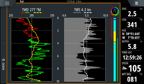
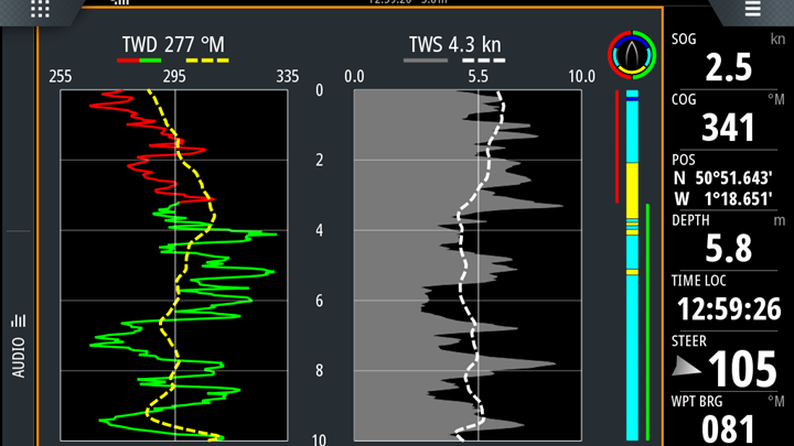
The Wind Plot app shows us two vertical strip graphs side by side. The one on the left is TWD and the one on the right is TWS. The most recent information is at the top, and the time intervals run down the middle; so that’s two-minute intervals showing 10 minutes of data in total.
If we take the TWD graph first, we can see that at the top by the title we have the most up to date reading (286 degrees). Below it are the lower, mid and upper bounds of the graph – in this case that’s 255, 294 and 335 degrees respectively.
The advantage of orientating the graph like this is that it shows the wind pattern as though looking into the wind: left-hand shifts are on the left of the graph, and right-hand shifts are on the right of the graph.
The graph line is red when the boat is on port tack, and green when it’s on starboard tack. The dashed yellow line is the trend line. This smooths out the noise in the data and shows clearly whether the wind is in a left or right-hand phase. In this example the boat is on port tack in a left-hand phase – so good tactics!
The right-hand strip graph shows us TWS in the same manner. The up to date reading (4.6kts) is beside the title and under that are the lower, mid and upper bounds of the graph – in this case that’s 0.0, 5.5 and 10.0 knots. The TWS is plotted in grey against the black background, and the trend line is a white dashed line. In this example, the wind is just starting to ease after a sustained puff.


